Graphic Identity, 2023
Legion of Honor museum

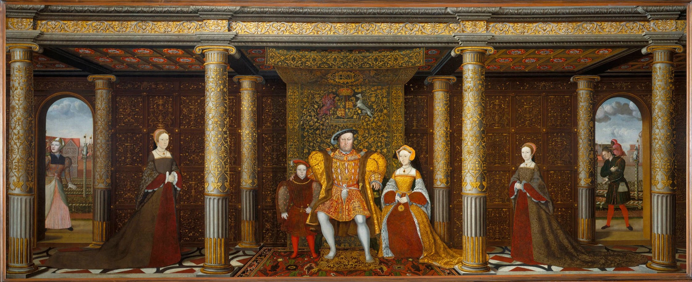
The Legion of Honor is the sole West Coast venue for the first major exhibition of Tudor portraiture, textiles, sculpture, silver, jewelry, and manuscripts in the United States. The exhibition follows the development of the arts in England from Henry VII’s seizure of the throne in 1485 to the death of his granddaughter Elizabeth I in 1603.
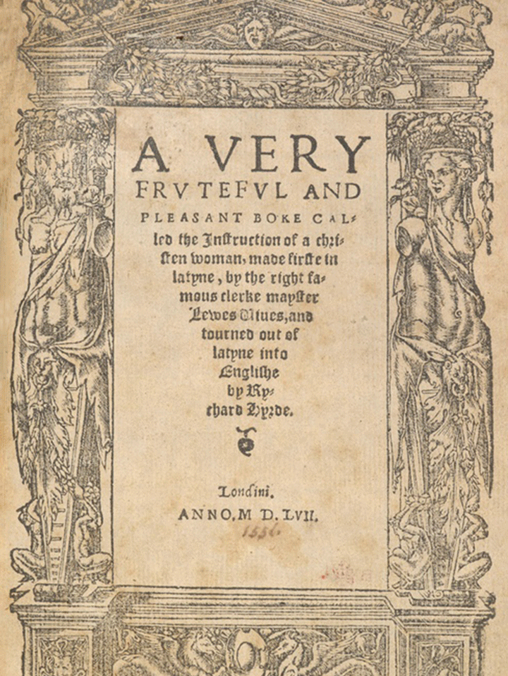
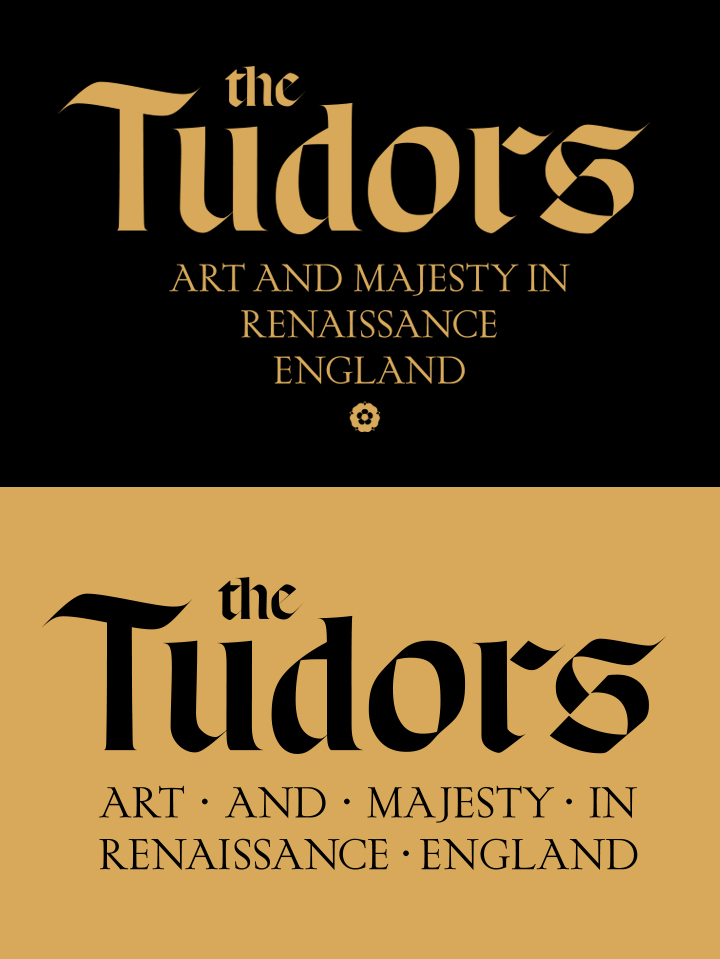
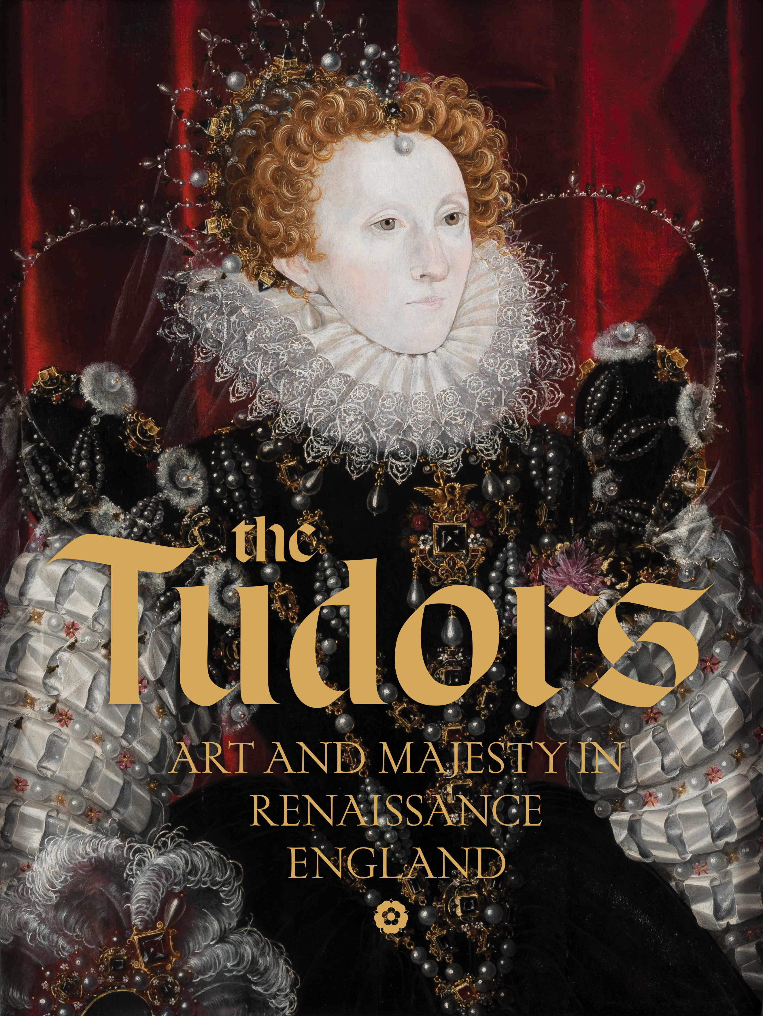
By examining typographic treatments in multiple manuscripts and art objects in the exhibition, I modeled the title treatment on historical precedent using a combination of Blackletter paired with a Humanist Roman typeface. The primary lock-up variation includes a conical or tapered typesetting finished by a dingbat in the shape of the Tudor Rose, the heraldic emblem of the House of Tudor.

Credits
Martin Chapman, curator
Tristan Telander, exhibition designer
Xiaoxi Chen, exhibition designer
Alejandro Stein, exhibition design director
Meghan Moran, senior exhibition graphic designer
Kate Agarwal, exhibition graphic designer
Jesse Beckman, graphics preparator
Typeset using Respira Black and Dear Sir Madam. Installation photography by Gary Sexton. Project submission on Fonts in Use.