Exhibition Graphics, 2025
de Young museum

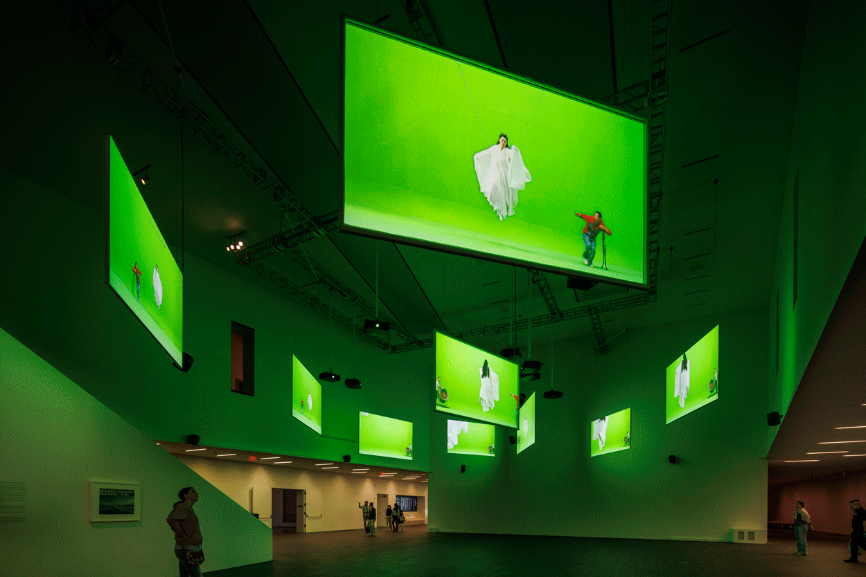
Isaac Julien: I Dream a World is the first retrospective in the United States for the British artist known for his immersive, multichannel video installations.
Julien's films revisit the past to create spaces of cultural memory that invite us to reframe our priorities in the present. In response, I wanted to source typography that was historically-grounded. As a newly acquired FAMSF artwork and one of the centerpieces of the de Young presentation, Lessons of the Hour served as the catalyst for typographic research. Lessons of the Hour is a poetic meditation on the life and work of writer, orator, and abolitionist, Frederick Douglass. I chose Roumald as a typeface that recalls the Scotch Roman typographic tradition of Douglass's time. Roumald's contemporary features—most notably the curvature and softness that’s been added to the counterforms to create an almost blurry feel to it—also served as an appropriate nod to the dreamlike quality of the artists work.

Julien's moving-image grammar incorporates an increasing number of projection screens to create conversations between disconnected places and temporalities. When constructing the title lock-up, I explored typographic treatments that were slightly fragmented, generating a sense of movement or choreography across the page. This was intended to reference the kind of visual rhythm the artworks possess in the multichannel installation format.
For marketing materials, I wanted to make use of a compositional style that involved integrating multiple images with large scale typography. This would allow us to represent each artwork from multiple angles, and in a sense, mirror the multichannel gallery experience. Unfortunately, this treatment didn’t end up in the final marketing campaign.
The gallery didactics were primarily housed in a central atrium, where individual films or pairs of videos branched off in a “choose your own adventure” manner. The FAMSF design studio commissioned the fabrication of photographic facsimiles to accompany each didactic text and embedded these aluminum mounted prints into the surrounding text. The compsosition of text and image employ the same visual rhythm and movement that inspired the title lock-up.


Credits
Claudia Schmuckli, chief curator of modern and contemporary art
Tristan Telander, exhibition designer
Alejandro Stein, exhibition design director
Jesse Beckman, graphics preparator
Typeset in Roumald. Installation photography by Henrik Kam & Randy Dodson. Gallery graphics production and installation by Sterling Graphics and Barker Blue. Project submission on Fonts in Use.