Graphic Identity, 2021
de Young museum

Alice Neel: People Come First, the first comprehensive West Coast retrospective of Neel’s work hosted by the de Young museum, positions Neel as one of the century’s most radical painters, a champion of social justice whose long-standing commitment to humanist principles inspired her life as well as her art.
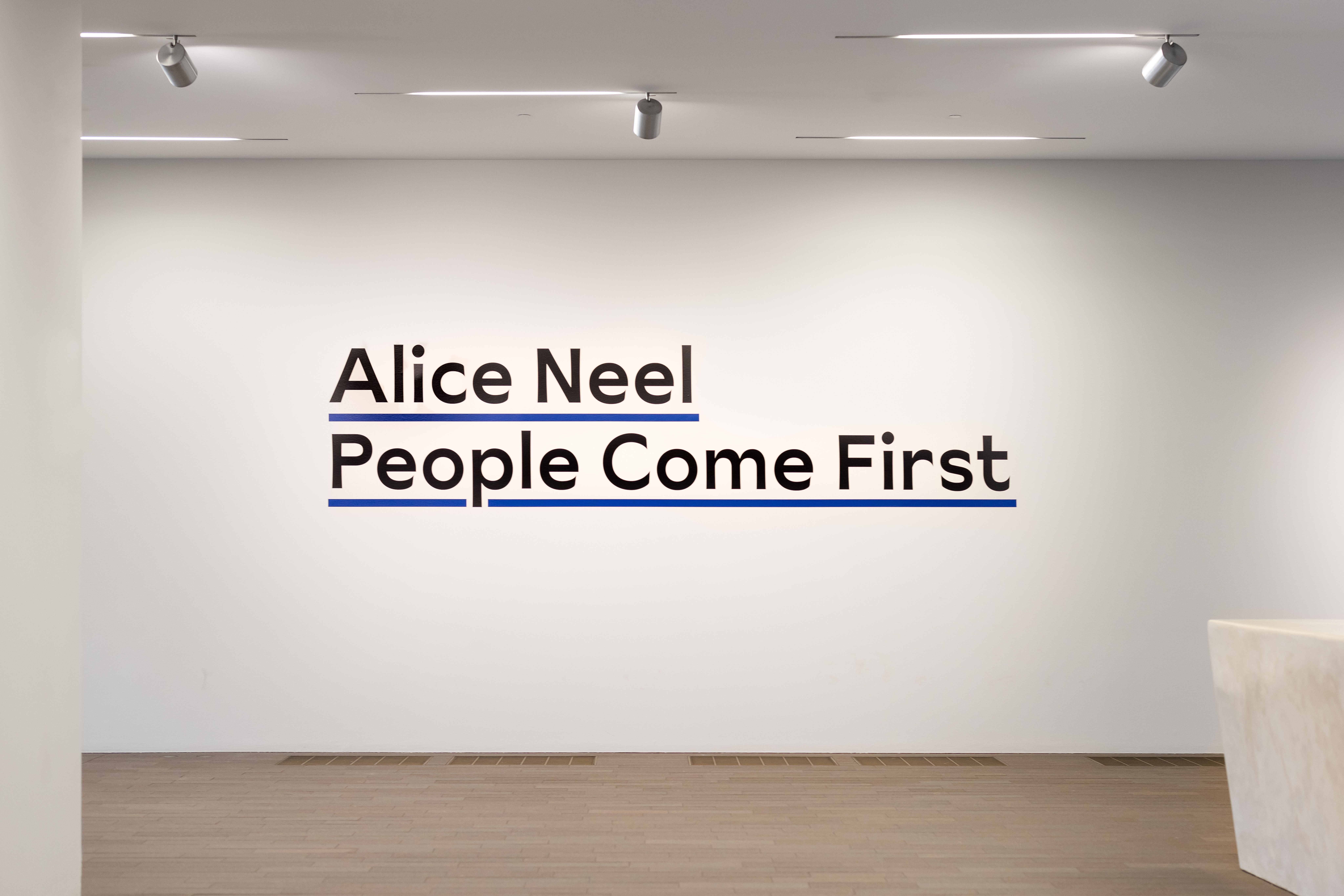
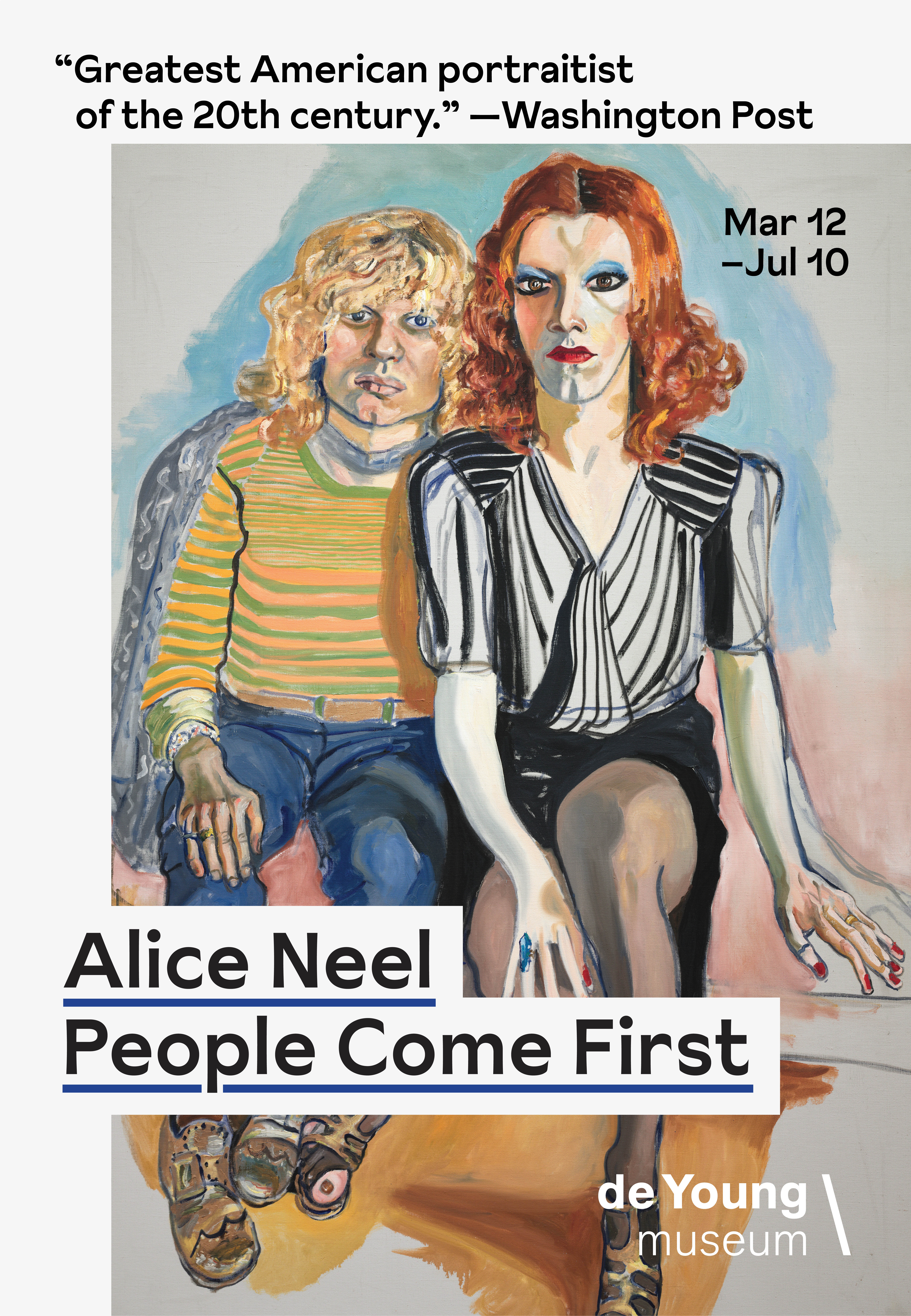
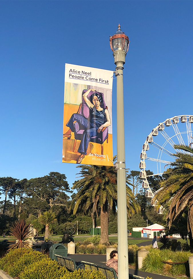
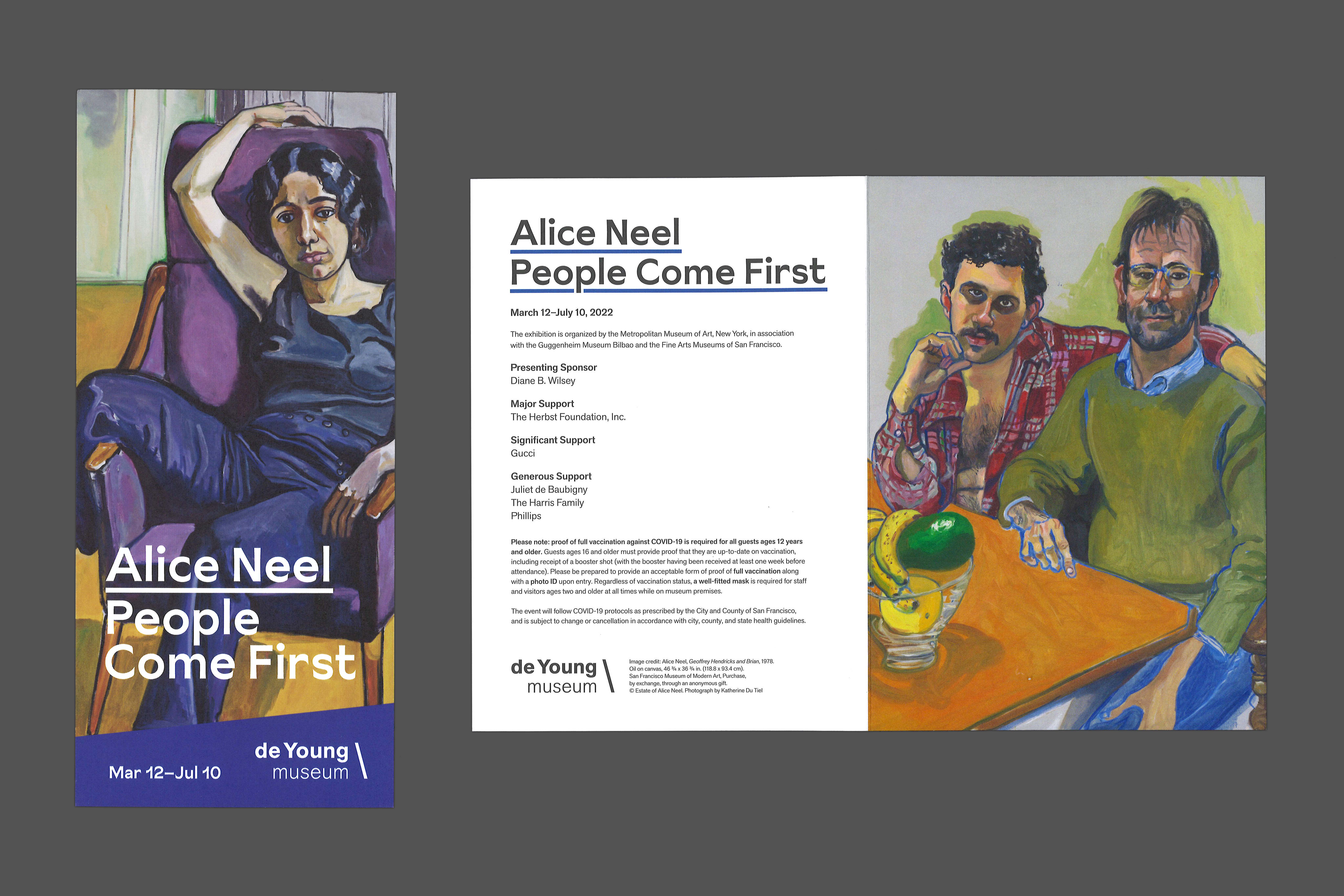
Drawing on Neel’s activism and the kind of spontaneous hand-lettering that is produced for protests, the title was typeset in Sunset Gothic, a painterly sans-serif with expressive and humanistic qualities. The title and subtitle are set at the same scale, establishing a non-hierarchical relationship between the artist and her sitters. The title also includes an underline which references the signature blue contour outline, a defining stylistic feature within Neel’s body of work.


Credits
Lauren Palmor, curator
Tristan Telander, exhibition designer
Alejandro Stein, exhibition design director
Katrina Coulourides, exhibition graphic designer
Jesse Beckman, graphics preparator
Typeset in Sunset Gothic. Installation photography by Gary Sexton. Project submission on Fonts in Use.