Identity System, 2022
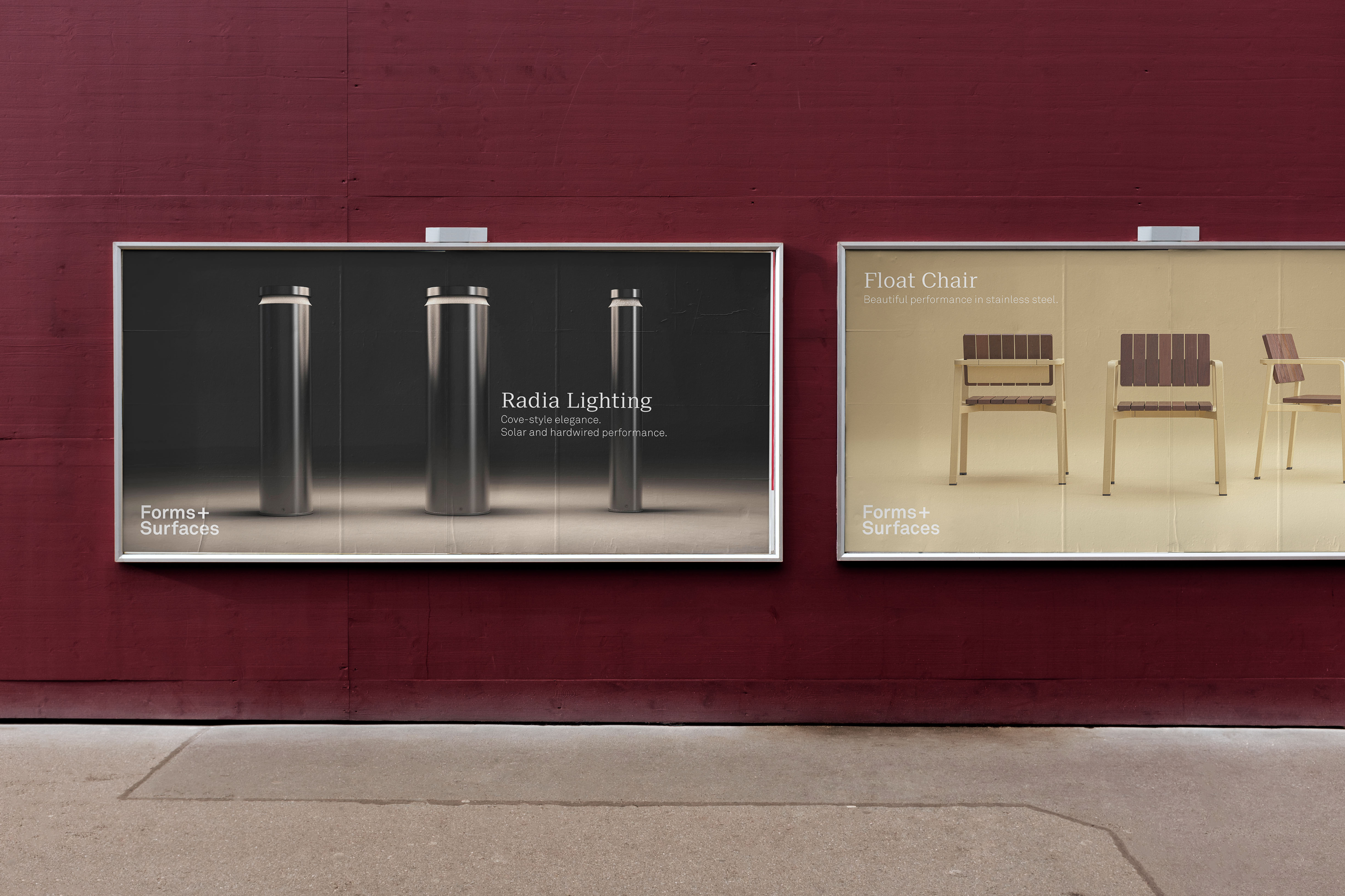
Forms+Surfaces is an architectural manufacturing company with a robust visual vocabulary and design offerings. Not only are their styles, materials and finishes recombinant, but interchangeable modules are also present in design families.
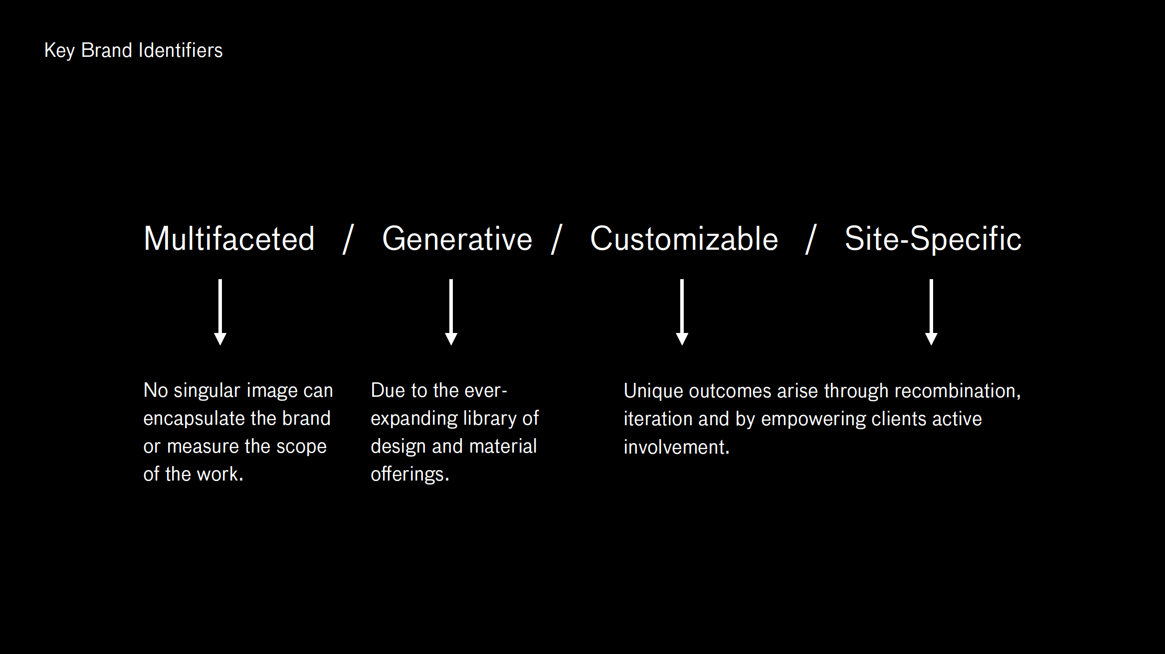
In a sea of products, the one constant that I perceived were the dynamics of the process itself. Leaning into the extreme variety and quantity of product offerings, I found it most compelling to imagine an identity that connects iterations, emphasizes difference and repetition, serialization and permutations.

Graphically, I became very interested in deconstructing the F+S plus sign and putting in back together again, but in an abstracted way so that it no longer resembles a plus sign. The strongest concept that emerged was taken from this checkerboard-esque form derived from the negative space surrounding the plus sign.
Each module has two blended gradient strokes—each representing the two strokes of the plus sign as well as the dual product categories—one for forms and one for surfaces. Each stroke contains a gradient blend which evokes a fluid, rather than a fixed state.
Each logo variation would have a specific role to play within the broader identity system. Structurally, we would designate one default mark, one for each product category, one for each branch location and one for all of the F+S design tools.
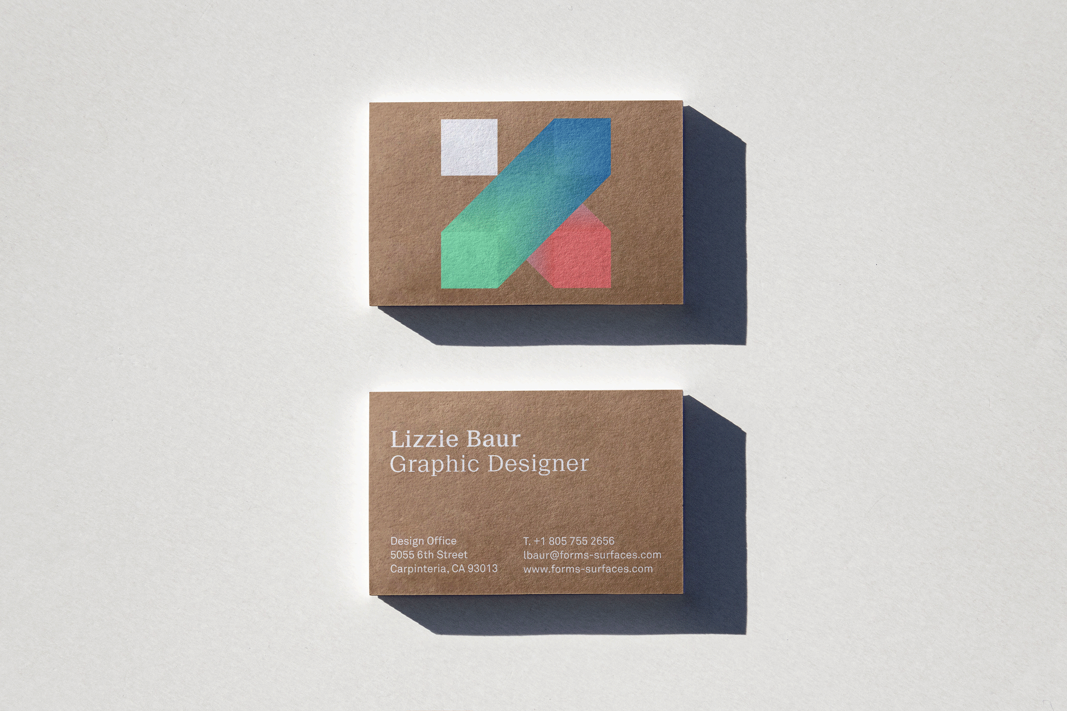
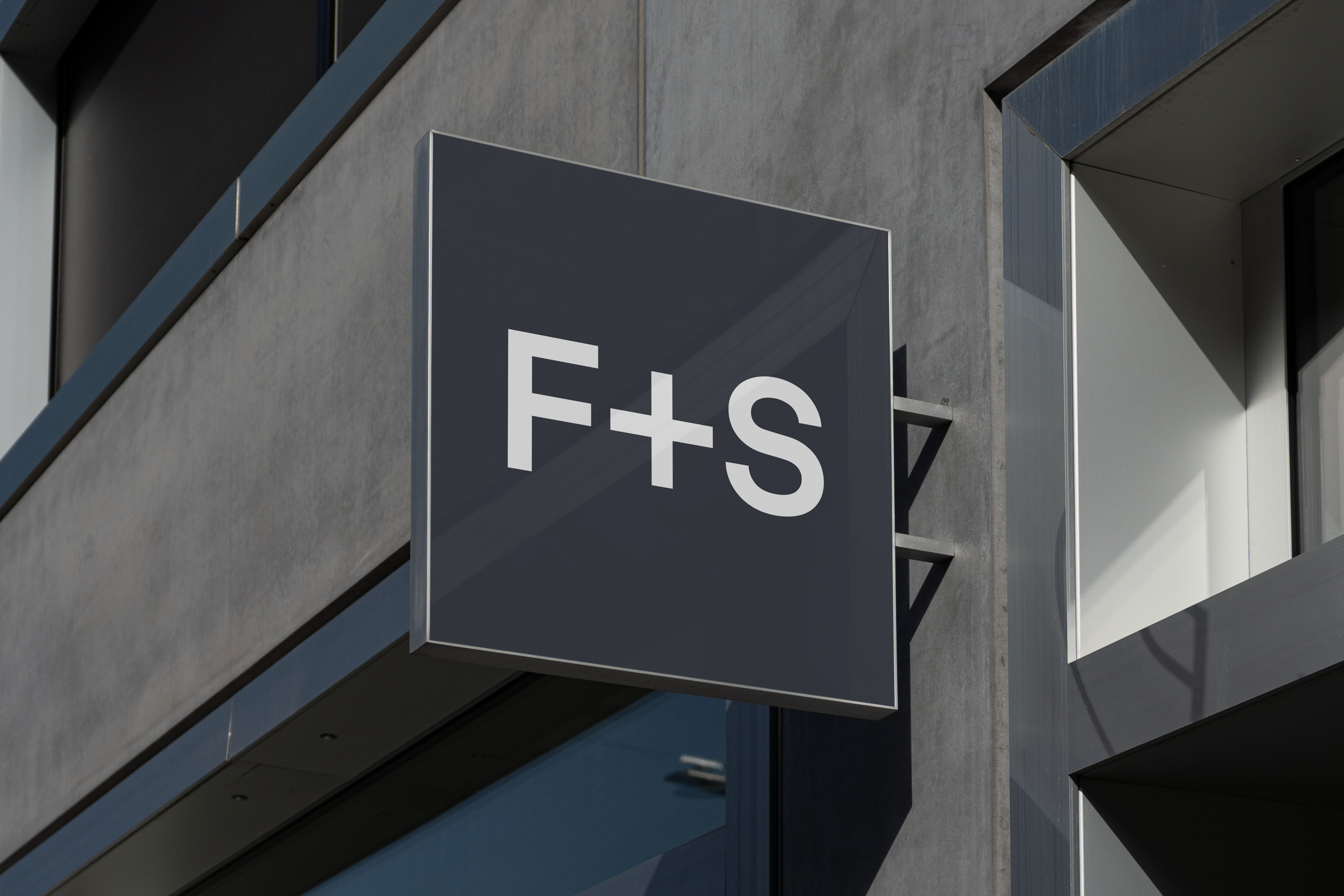
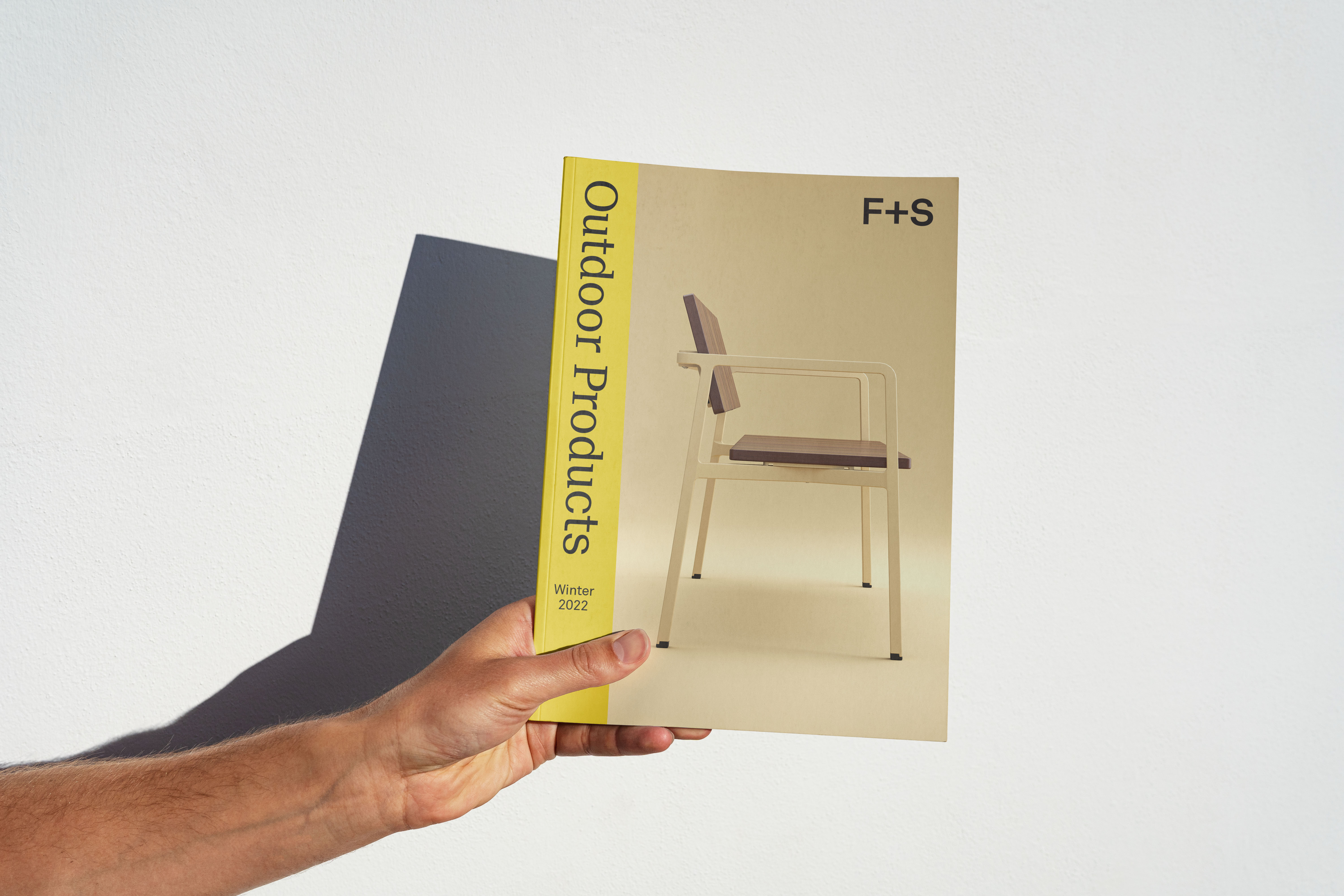
Once the mark had been constructed, I introduced updated logotypes into the relationship. The advent of an F+S abbreviated logo marks the adoption of a natural trajectory in the brand’s evolution. The behavior of the logotypes, as they expand and contract, oscillating between shorthand and longhand, demonstrates an identity constantly in flux, adapting to meet the needs of the market and their clients.
*Unrealized concepts.
Typeset in Akkurat and Suisse Neue.